How to Make Bubble Letters in PowerPoint Using 3 Easy Methods
Bubble-style text works well for cover slides and section headers. It helps titles stand out during presentations. Plain text often looks flat and gets missed on screens. Many users want a simple way to improve slide design without extra tools. PowerPoint can handle this easily.
Next, this guide shows three simple methods for creating bubble letters in PowerPoint using built-in features like WordArt text effects and shapes. Each method is easy to adjust and helps text look more clear and bolder on slides. You can use them for titles, headers, or school and business presentations. Start with the first method below to build your design step by step. It is simple and beginner-friendly in PowerPoint.
What Are Bubble Letters
Bubble letters are a style of lettering where each character looks round and full. The shapes often look inflated, like soft balloons. The edges are smooth instead of sharp. This gives the text a bold and rounded appearance.
These letters usually have thick forms. The inside spaces are open and simple. The overall look is soft and even. The style often feels less strict than normal fonts. It focuses more on shape than detail.
In PowerPoint, bubble letters come from font choices and visual effects. Some fonts already have rounded shapes that look close to bubble lettering. Designers then adjust the text using formatting tools. Fill color changes the inside of the letters. Outline adds a border that makes the shape stand out. Glow creates a soft light around the text. Shadow adds depth behind the letters. These effects work together to build the bubble style inside slides. The result is text that looks smooth, bold, and shaped for visual emphasis on a slide.
How to Create Bubble Letters in PowerPoint
Bubble letters in PowerPoint are created using bold fonts, colors, and text effects. They help make titles stand out with a soft, rounded look that is easy to read.
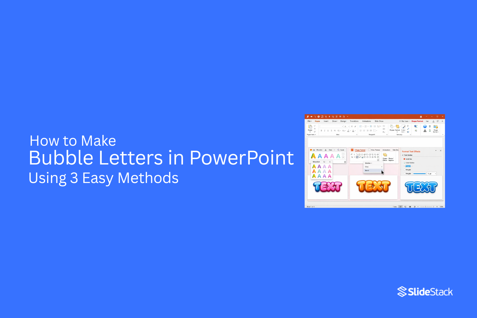
Method 1: Create Bubble Letters Using Text Effects
This method uses built-in text formatting tools in PowerPoint to turn normal text into rounded bubble-style lettering. It works best for slide titles, headings, and short words where the effect needs to stand out clearly.
This approach focuses on layering, color contrast, and text effects to create a soft, bold bubble look without needing external design tools.
Step 1: Go to Insert -> Text Box, click on the slide, and type your title text.
Step 2: Select a font with soft edges and thicker strokes, e.g., Arial Rounded, Calibri (Bold), Comic Sans, or Amasis MT Pro Black. Increase the font size so the effect is clearly visible.
Step 3: Highlight the text and copy it using CTRL+C (Windows) or Command+C (Mac) or via the right-click context menu.
Step 4: Select the text, go to Shape Format, and choose a bright or light color for Text Fill.
Step 5: Add a thicker Text Outline in a darker shade of the same color. This combination creates the core bubble appearance. To do this, go to Format Shape -> Text Options -> Text Outline.
Step 6: Open Text Effects, add a subtle Shadow or Glow. Keep these effects soft so the letters stay round and readable.
Step 7: Paste the text using CTRL+V (Windows) or Command+V (Mac) or via the right-click context menu. Change the color of the second layer to a slightly different shade, then align it behind the first layer to build the bubble depth effect.
Method 2: Create Bubble Letters Using WordArt
If more control is needed for a stronger bubble look, WordArt works well.
Step 1: Go to Insert → WordArt. Pick a simple style with flat fill and no gradient.
Step 2: Select the WordArt. Open Shape Format. Use Shape Fill to apply a solid color. Use Shape Outline to increase the outline weight.
Step 3: Set the outline color to a slightly darker or contrasting shade.
Round shapes matter here. Keep edges smooth. Avoid sharp corners and thin outlines. A thicker outline with a clean, solid fill helps the letters look full and inflated.
Method 3 – Designing Bubble Letters with Shapes
Shapes in PowerPoint give full control over letter style. This method works well for custom bubble letters that do not rely on fonts.
Step 1: Start with basic shapes. Pick rounded shapes like circles or ovals. Place them on the slide to form each letter. Adjust the size so each shape fits the letter structure.
Step 2: Use multiple shapes for one letter. For example, an “O” can be a single circle. An “B” needs one straight shape with two rounded parts added beside it.
Step 3: Move shapes closer together until they look like one connected letter. Small gaps can break the bubble effect, so keep spacing tight.
Step 4: Select all shapes that form a letter. Group them together. This keeps each letter fixed as one unit.
Step 5: Copy the grouped letter to build full words. Change colors or add outlines for style. A soft fill color works well for a bubble look.
This method takes more time but gives full control over the design.
Choosing the Right Fonts for Bubble Letters
Font choice shapes the whole look of bubble letters in PowerPoint. A rounded and bold font works best. Thin or sharp fonts do not give the soft, inflated style. Start with simple fonts like Arial Rounded or Comic Sans. These already have soft edges that fit the bubble style. From there, adjust the weight to make the letters thicker.
Some fonts may need extra work inside PowerPoint. That is normal. A basic font can still become a bubble style with shape effects and formatting. Keep the design easy to read. Overly decorative fonts can make the text hard to understand, especially on slides with more content.
Applying Colors and Fills for Bubble Effects
Bubble letters need strong color choices. Color gives them shape and style.
Start by selecting the text box with your letters. Click the Shape Format tab at the top. Open the Shape Fill option. Pick a bright color like blue, pink, or yellow.
Solid fills give a clean look. Gradient fills add soft changes between two colors. That mix can make the letters feel rounded.
Move to Shape Outline next. Add a thick outline around each letter. A darker shade works well for this step. It helps the bubble shape stand out on the slide.
Shadow effects also support the bubble look. A small shadow adds depth behind the letters. Keep the shadow light so the text stays easy to read.
Strong contrast between fill and outline keeps the design clear. Bright fill with a darker outline creates a bold style that fits bubble letters well.
Adding Outlines, Shadows, and Glow Effects
Bubble letters start to stand out when they gain depth and shape. PowerPoint offers simple effects that help build this look without extra tools. Start with the outline. Select the text, then open the text formatting options. Add a thick outline around each letter. A bold outline helps define the shape and makes the letters look fuller. Black or dark colors often work best for contrast.
Next comes the shadow. Apply a soft shadow behind the text. Keep the blur light so the shadow does not look harsh. A small offset creates a lifted effect that makes the letters feel like they sit above the slide. Glow effects add another layer. Choose a soft glow around the edges of the letters. Use a light color that matches or complements the fill. The glow should stay subtle so the letters do not lose their shape.
Each effect builds on the next. The outline gives structure. The shadow adds depth. The glow brings softness. Together, they create the classic bubble letter style inside PowerPoint.
Adjusting Spacing and Alignment
Good spacing helps bubble letters look clean and easy to read. Crowded letters can feel messy. Too much space can break the word apart. Start by selecting your text box in PowerPoint. Move the letters closer or farther apart using the character spacing tool in the font settings. Small changes make a big difference in how the text looks.
Alignment also matters. Centered text often works best for bubble letters, especially on title slides. It keeps the design balanced on the page. Left alignment can work for longer lines, but it may feel uneven with rounded letter styles.
Line spacing should stay simple. Keep enough room so each line does not touch the next. This helps the bubble effect stay clear and easy to see. After small adjustments, step back and look at the slide. The goal is simple. The letters should feel balanced, readable, and smooth across the slide.
Enhancing the Bubble Effect
Here are a few tips to improve the look of bubble text in PowerPoint.
Add a Highlight Effect: Duplicate the text layer and place it on top. Make this copy slightly smaller. Change it to a lighter color. Shift it a little upward. This creates a soft shine on the letters.
Use Gradients Sparingly: A light gradient can add depth. Use a lighter tone at the top and a slightly darker tone at the bottom. Keep the change very subtle. Strong gradients can make the bubble style lose its clean look.
Keep Backgrounds Simple: Plain or lightly textured backgrounds work best. Busy images pull attention away from the text. A simple background keeps the bubble effect easy to read.
Shadows and Glow Effect: Shadow or glow can smooth the edges and improve depth. Either one can be used alone, but adding at least one helps the text feel more polished and soft.
Common Mistakes to Avoid
While bubble text can add visual appeal, a few common missteps can make slides look messy or hard to read. Small design choices affect how clear your message feels. Keeping the focus on readability helps the slide stay strong and easy to follow.
Using Thin or Narrow Fonts
Bubble letters need strong shapes to look right. Thin fonts do not hold their form well. Sharp edges also break the smooth bubble effect.
This makes the text look weak. It also reduces clarity on the screen. The design loses its bold style.
Overusing Shadows or Heavy 3D Effects
Shadows, glow, and 3D styles can add depth to text. Too many effects reduce clarity. The letters start to blur together.
This makes reading harder. The slide feels busy. The message becomes less clear.
Applying Bubble Text to Long Paragraphs
Bubble text works best for short words and headings. Long sentences do not fit this style. The spacing becomes tight and uneven.
This slows down reading. The slide feels crowded. Key points become harder to spot.
Mixing Too Many Bright or Contrasting Colors
Strong colors can make bubble text stand out. Too many colors create visual noise. The design loses balance.
This draws attention away from the message. The slide feels scattered. Text becomes harder to focus on.
Advanced Design Techniques for Bubble Letters
Bubble letters can look simple at first. Small changes in design can make them stand out more on a slide. Start with layering. Duplicate your letter shape. Place one layer slightly behind the other. Use a darker color on the back layer. This adds depth and makes the letter look bold.
Next comes gradient control. A soft gradient can give a rounded feel. Keep the light area on one side. Keep the darker tone on the opposite side. This helps the letter look like it has volume. Shadow work also matters. Add a soft shadow under each letter. Keep the blur low. Keep the distance small. This keeps the text readable while still adding depth.
Spacing also plays a role. Give each letter enough room. Tight spacing can make bubble letters look crowded. Balanced spacing keeps the design clean and easy to read. Small highlights can change the look a lot. Add a thin white shape on one side of each letter. Keep it small and curved. This gives a glossy effect, like light is hitting the surface.
Try mixing styles inside one word. Some letters can stay flat. Some can have stronger shadows or highlights. This creates visual interest without making the design messy.
Use Cases of Bubble Letters in Presentations
Bubble letters can change how a slide feels right away. They add a soft and fun look. They also help text stand out from plain fonts. One common use is for titles. A big heading in bubble style grabs attention fast. It helps the audience know the main idea of the slide without effort.
They also work well in school projects. Students often use them for creative topics like art, games, or stories. The style makes slides feel less formal and more engaging. Marketing slides use bubble letters, too. They help highlight a product name or a key message. The rounded shape feels friendly, which can help the message feel more open and easy to read.
Some presenters use them for section breaks. A single bubble word can mark a new part of the presentation. This gives a clear pause and keeps the flow organized. Even simple notes or keywords can look better with this style. It turns plain text into something more visual, without adding extra design elements.
Final Notes
Bubble letters add strong visual weight to presentation slides. They make titles stand out clearly. They help direct focus toward key ideas on the screen. These effects work best in small amounts. Too many styled words can reduce clarity. Simple slides support easier reading and better flow for the audience. No special fonts or extra tools are needed for this style. Standard PowerPoint text settings and shapes are enough to build the effect.
Rounded letter shapes form the base. Outlines add structure. Soft shadow effects give depth. Use this method for main slide titles and short headers. Keep the same style across slides so the presentation stays consistent. This supports clear reading and helps the audience follow each point with ease. More styling practice in PowerPoint can build stronger slide design skills over time.
FAQs:
1. What are bubble letters in PowerPoint?
Bubble letters are rounded and bold text styles. Each letter looks soft and full. They often look like inflated shapes. PowerPoint uses fonts and effects to create this style.
2. Do I need extra software to create bubble letters?
No extra tools are needed. PowerPoint has built-in features like WordArt, text effects, and shapes. These tools are enough to create bubble letters.
3. Which fonts work best for bubble letters?
Fonts with rounded and thick shapes work well. Examples include Arial Rounded and Comic Sans. Bold fonts also help improve the bubble effect.
4. Can I use bubble letters for long sentences?
Bubble letters work better for short text. Titles and headings fit the style well. Long sentences can look crowded and hard to read.
5. What is the easiest method to create bubble letters?
Using text effects is the simplest method. You can adjust fill color, outline, shadow, and glow directly inside PowerPoint.
6. Why do outlines matter in bubble letters?
Outlines define the shape of each letter. A thick outline helps the text look fuller and clearer on the slide.
7. How do colors affect bubble letters?
Colors shape the visual style. Bright fills with darker outlines create strong contrast. This makes the letters stand out more.
8. Can I create bubble letters using shapes only?
Yes. You can build each letter using circles and ovals. This method gives full control but takes more time.
9. What mistakes should I avoid?
Avoid thin fonts, too many effects, long paragraphs, and too many bright colors. These reduce clarity and make slides harder to read.
10. Where should I use bubble letters in presentations?
They work best for titles, section headers, and key words. They help important points stand out on slides.


You may also be interested in ...

How To Create An Eye-Catching Portfolio
If you’re looking to create an eye-catching portfolio, this post will come in handy. In this article, you can find the easies...
23 Jun, 2024

How To Easily Create An Infographic
Infographics are the perfect way to make a presentation that will impact an audience, but their design and composition might...
08 Jun, 2024

PowerPoint Template Tips & Tricks You Ne...
PowerPoint seems to be an unknown world for many people, especially those who have been assigned to create a presentation out...
08 Jun, 2024