How to Create a Waterfall Chart in PowerPoint and Excel
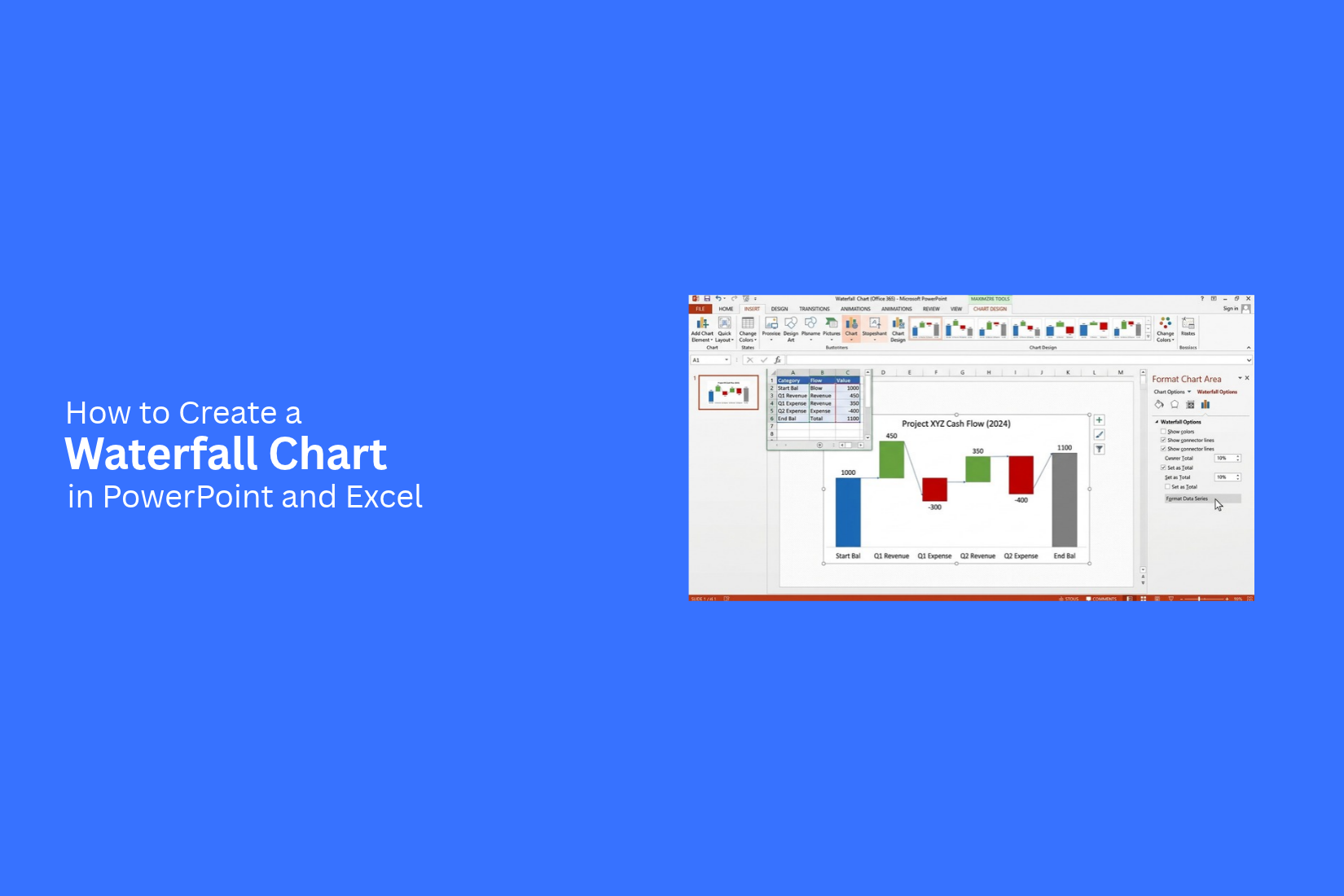
Showing how values change over time can be hard with a basic chart. Readers may miss how each increase or decrease affects the final result. This can make financial reports, budget reviews, and business presentations harder to follow.
A waterfall chart can help solve this problem. It shows how positive and negative values affect a starting amount and lead to a final total. Clear bars, labels, and colors help readers follow each change. However, the chart must be set up correctly to show the data in a clear way.
You can create a waterfall chart in both PowerPoint and Excel. This guide explains how to prepare your data, insert the chart, set total bars, and format its design. You will also learn how to add an Excel chart to PowerPoint and avoid common mistakes.
What Is a Waterfall Chart?
A waterfall chart shows how different values affect a starting amount over time. It uses floating bars to show increases, decreases, and the final total. Each bar represents a change in value, such as added revenue, lower costs, or changes in profit.
This chart helps readers see how each step affects the overall result. For example, a business can use a waterfall chart to show how it moves from starting revenue to final profit. The chart can display each gain and loss along the way.
Waterfall charts are useful for financial reports, budget reviews, sales reports, and business presentations. You can create one in Excel to work with your data. You can also use PowerPoint to present the results in a clear visual format.
How to Create a Waterfall Chart in PowerPoint
A waterfall chart in PowerPoint helps you show how different values affect a starting amount. You can use it to explain changes in revenue, costs, profits, or budgets. PowerPoint also lets you edit the chart data in Excel and change its appearance to match your presentation.
Prepare Your Data
Start by organizing your data in a clear table. List each step in the order you want to show it. Add a label for each step and its value.
For example, you can use monthly revenue data to show how income changes over time. Positive values represent increases. Negative values represent decreases.
Keep your labels short and easy to read. Check each value before creating the chart. Correct data helps your chart show the right results.
Insert a Waterfall Chart
PowerPoint has a built-in waterfall chart option. You can use it to turn your data into a visual chart.
Follow these steps:
- Open your PowerPoint presentation and go to the slide where you want the chart.
- Click the Insert tab in the top menu.
- Select Chart to open the chart options.
- Choose Waterfall from the chart types.
- Click OK to insert the chart.
PowerPoint will open a small Excel worksheet with sample data. The chart will use this data until you replace it with your own values.
Edit Chart Data in Excel
The Excel worksheet lets you change the labels and values in your chart. Replace the sample data with the information you prepared earlier.
Follow these steps:
- Find the category labels in the first column.
- Replace the sample labels with your own data labels.
- Enter your values in the next column.
- Add or remove rows to match the number of steps in your chart.
- Close the worksheet after entering your data.
PowerPoint will update the chart based on your changes. Review the bars and labels to make sure they match your data. You can also edit the data later. Select the chart, open the Chart Design tab, and click Edit Data. The Excel worksheet will open again so you can make changes.
Format the Chart
A clear design makes your waterfall chart easier to read. PowerPoint provides tools to change the chart colors, labels, layout, and other visual details. Select the chart to open the chart tools. Use the Chart Design tab to choose a chart style or change the colors. You can also add a chart title, axis titles, and data labels.
Use different colors for increases and decreases. This helps readers see which values raise the total and which ones lower it. Keep the background simple and use readable text. You can also adjust the size of the chart to fit your slide. Leave enough space around the chart so the labels do not look crowded. Make sure the most important values stand out.
Set Total and Subtotal Bars
Waterfall charts often include a final total or an intermediate subtotal. These bars show the combined value at a specific point in the chart. PowerPoint lets you mark selected bars as totals.
To set a bar as a total:
- Select the waterfall chart.
- Click the bar you want to change. Click it again to select only that data point.
- Right-click the selected bar.
- Choose Set as Total from the menu.
The selected bar will start from the baseline instead of continuing from the previous value. This makes it easier to identify a total in the chart. Repeat these steps for other total or subtotal bars. Check the chart after each change to make sure the bars represent your data correctly. A well-marked total helps your audience understand the final result without having to calculate every step.
How to Create a Waterfall Chart in Excel
Excel lets you create a waterfall chart to show how different values affect a starting amount. You can use it to show changes in profit, costs, revenue, or budgets. Follow these steps to build your chart and adjust it to fit your data.
Organize Your Data
Start by placing your data in two columns. Use the first column for categories and the second for values. Each row should show a change in the total.
For example, you can list starting revenue, added sales, operating costs, and ending revenue. Enter positive values for increases and negative values for decreases. Keep the starting and ending values in separate rows.
Insert a Waterfall Chart
Once your data is ready, select both columns, including the headings. Follow these steps:
- Open the Insert tab in Excel.
- Find the Waterfall or Stock Chart option in the Charts group.
- Select Waterfall from the chart options.
- Excel will create a chart based on your selected data.
Check the chart to make sure each category appears in the right order. The bars should show how each change affects the running total.
Set Total and Subtotal Values
Waterfall charts use different bar types to show changes and final values. You can mark key bars as totals or subtotals. This helps readers separate individual changes from the final amount.
To set a total or subtotal:
- Click the bar you want to change.
- Click the bar again to select only that data point.
- Right-click the selected bar.
- Choose Set as Total from the menu.
Repeat these steps for other bars that should show a total. Excel will anchor each selected bar to the chart's baseline. This makes the total easier to read.
Customize Chart Colors and Labels
Chart colors help readers tell increases, decreases, and totals apart. Excel lets you adjust the chart's appearance to match your presentation or report. Select the chart to open the chart formatting options. Use Chart Design to choose a chart style or color set. You can also right-click a bar and open Format Data Point to change its fill color.
Add labels to show the values on each bar. Select the chart, click the Chart Elements (+) button, and turn on Data Labels. You can also add a chart title and axis titles. Keep labels short and easy to read. Make sure the text does not overlap with other chart elements.
Update the Chart Data
Your chart may need changes as new data becomes available. Excel lets you edit the source values without creating a new chart. Open the worksheet that holds your chart data. Change the values or category names in the source table. The chart should update to reflect those edits.
You can also add new rows to the source data. Check that the chart includes the new categories. If the chart does not show them, select the chart and open Chart Design. Choose Select Data to review or adjust the data range. Before sharing the chart, check the order of the bars, total values, labels, and colors. A clear chart helps readers follow each change from the starting value to the final result.
How to Add an Excel Waterfall Chart to PowerPoint
An Excel waterfall chart can help you present financial data in PowerPoint. You can copy the chart into a slide, embed the Excel file, link the chart to its source data, or insert it as an image. Each method works a little differently. The best choice depends on whether you need to edit the chart or keep it as a static visual.
Copy and Paste the Chart
Copying and pasting is a quick way to add an Excel waterfall chart to PowerPoint.
- Open your Excel workbook and select the waterfall chart.
- Press Ctrl + C to copy the chart.
- Open your PowerPoint presentation and select the slide for the chart.
- Press Ctrl + V to paste it.
- Choose a paste option to control how the chart appears in PowerPoint.
You can paste the chart as an Excel chart or use the destination theme to match your slide design. Check the chart size and labels after pasting. Adjust them to fit the slide.
Embed or Link the Excel Chart
PowerPoint lets you embed or link an Excel chart. Your choice affects how the chart data works after you add it to a slide. Embed the chart: This option stores a copy of the Excel data in the PowerPoint file. You can edit the chart data from PowerPoint. The chart does not depend on the original Excel workbook.
Link the chart: This option connects the chart to its source Excel workbook. Changes to the source data can appear in PowerPoint after the link updates. Keep the Excel file in its original location to help maintain the connection. To embed or link the chart, copy it from Excel. Open PowerPoint and select Home > Paste > Paste Special. Choose an option that embeds or links the chart as a Microsoft Excel Chart Object. The available options may vary by version.
Update Linked Chart Data
A linked waterfall chart can reflect changes made to its Excel source file. This helps you keep your slides up to date without rebuilding the chart.
Follow these steps to update a linked chart:
- Open the Excel workbook linked to your PowerPoint chart.
- Edit the source data in Excel.
- Save the workbook.
- Open PowerPoint and check the linked chart.
- Update the link if PowerPoint does not show the latest data.
You can also manage links from PowerPoint. Look for File > Info > Edit Links to Files. The exact location may vary by version. From there, you may be able to update the link or change its source. Always check the chart after an update. Make sure the values, labels, and total bars still match your data.
Insert the Chart as an Image
A chart image is a good choice for a presentation that does not need chart data edits. It keeps the chart's appearance fixed and removes the need to maintain a link to an Excel workbook.
To insert the chart as an image:
- Select the waterfall chart in Excel.
- Copy the chart.
- Open PowerPoint and select the target slide.
- Open the paste options and choose a picture format, such as Picture or Paste as Picture.
- Resize and position the image on the slide.
You can also save the chart as a PNG or JPEG image in Excel, then use Insert > Pictures in PowerPoint to add it. Check the image quality after resizing. Use a high-resolution image to keep the chart text and bars clear. Since the chart is now an image, you cannot edit its data or individual chart elements in PowerPoint. Make any chart changes in Excel and insert the updated image again.
How to Customize a Waterfall Chart
A clear waterfall chart helps readers follow each change in a set of values. PowerPoint offers several ways to adjust its colors, labels, and layout. These edits can make the chart easier to read and help key figures stand out.
Change Bar Colors
Bar colors help readers tell different types of values apart. Waterfall charts often use separate colors for increases, decreases, and total values.
To change the bar colors in PowerPoint:
- Select the waterfall chart.
- Click a bar to select the data series.
- Right-click the bar and select Format Data Series.
- Open the Fill options and choose a color.
- Repeat the steps for other data series as needed.
Use one color for increases and another for decreases. Give total bars a separate color. Keep the palette simple so the chart stays easy to read.
Add Data Labels and Connector Lines
Data labels show the exact value of each bar. They help readers understand the changes without checking the source data.
To add data labels:
- Select the chart.
- Click the Chart Elements (+) button beside the chart.
- Check Data Labels.
- Choose a label position that keeps the values clear.
You can also right-click a data label and select Format Data Labels to adjust its position and number format. Connector lines link each bar to the next step in the chart. They help readers follow how one value leads to another. To show these lines, select the chart and open the Format Data Series options. Look for the setting for connector lines and turn it on. The exact steps may vary by PowerPoint version.
Edit the Chart Title and Axis Labels
A clear title tells readers what the chart measures. Axis labels add context to the values shown in the chart. To edit the chart title, click the title box and type your new text. Use a short title that describes the data, such as Monthly Revenue Changes or Project Cost Breakdown.
To add or edit axis titles:
- Select the chart.
- Click the Chart Elements (+) button.
- Check Axis Titles.
- Click each title box and enter the right text.
Use a label such as Revenue ($) for a chart that shows revenue. Keep category names short so they fit along the horizontal axis. For number values, use a consistent format across the chart.
Adjust the Chart Layout
The chart layout affects how readers view the data. A few small changes can make the chart easier to follow. Select the chart and open the Chart Design tab. Try the available chart styles and layout options. Choose one that keeps the bars, labels, and title easy to read. You can also resize the chart by dragging its corners. Give the chart enough room so category names and data labels do not overlap. Keep the bars wide enough to see each value clearly.
For a presentation, place the chart where readers can see it without zooming in. In Excel, adjust the chart size to fit the worksheet and keep the related data nearby. Use the same color scheme and number format across related charts to maintain a consistent look.
Common Mistakes to Avoid When Creating Waterfall Charts
A waterfall chart should make changes in your data easy to follow. Small errors can make the chart hard to read or lead to wrong conclusions. Keep these common mistakes in mind as you build your chart in PowerPoint or Excel.
Using Incorrect Data
Incorrect data can make a waterfall chart show the wrong results. Check each starting value, increase, and decrease before creating the chart. Make sure every value matches your source data. Review the final result to confirm that the changes add up correctly.
Forgetting to Mark Total Bars
Total bars show the full value at key points in the chart. Without these markers, readers may mistake a running total for a single increase or decrease. In PowerPoint or Excel, mark the correct bars as totals. Use this for the starting value, final result, and any key subtotals.
Adding Too Many Categories
Too many categories can make a waterfall chart crowded. Readers may find it hard to track each change. Keep the chart focused on the most useful data points. Group small items into broader categories to make the chart easier to read. Place extra details in a separate table or slide.
Using Unclear Colors and Labels
Colors and labels help readers understand each change. Use one color for increases, another for decreases, and a separate color for totals. Keep the color choices consistent across the chart. Add short, clear labels to each bar. Show values directly on the bars when space allows. Use a readable font size so readers can follow the data without extra effort.
Tips for Presenting Waterfall Charts Effectively
A clear waterfall chart helps your audience follow each change in a total. Good design makes the data easier to read and understand. Use these tips to present your chart with confidence.
Highlight Key Changes
Give more attention to the changes that have the greatest effect on the final result. Use a bold color for major increases or decreases. You can also add a short note beside a key bar. This helps your audience spot the main points without reading every value.
Keep Labels Short
Use short labels for each bar. Long text can make the chart crowded and hard to read. Choose clear terms such as Revenue, Costs, Profit, and Total. Add data labels to show exact values. Keep the text large enough for people to read from a distance.
Use Consistent Colors
Assign clear colors to increases, decreases, and total values. For example, use green for increases, red for decreases, and blue for total bars. Keep the same color rules across all charts in your presentation. This helps your audience understand each bar without checking the chart key every time.
Check Chart Readability
Review the chart before adding it to your presentation. Check the labels, values, bar sizes, and spacing. Make sure the text is easy to read on a large screen. Remove extra gridlines or other details that do not help explain the data. A clean chart keeps the focus on the changes and the final result.
Final Notes
A waterfall chart helps show how increases and decreases affect a starting value and lead to a final result. You can create one in PowerPoint or Excel to present revenue, costs, profits, and budgets. Start with correct data, mark total bars, and use clear labels. Keep the colors consistent so readers can tell each type of value apart.
You can also add an Excel waterfall chart to PowerPoint. Choose a linked chart if you need to update it from the Excel file. Use an embedded chart if you want to edit the data in PowerPoint. A chart image works well if you only need a fixed visual. Check the values, labels, and layout before sharing your presentation.
Frequently Asked Questions
1. What is a waterfall chart?
A waterfall chart is a data visualization that shows how positive and negative values affect a starting amount to reach a final total. It is commonly used for financial reports, budgets, revenue analysis, and profit breakdowns.
2. How do you create a waterfall chart in PowerPoint?
To create a waterfall chart in PowerPoint, go to Insert > Chart and select Waterfall. Replace the sample data with your own values in the Excel worksheet, then customize the chart colors, labels, and total bars.
3. How do you create a waterfall chart in Excel?
In Excel, organize your categories and values in two columns. Select the data, go to Insert, choose Waterfall or Stock Chart, and select Waterfall. You can then format the chart and mark specific bars as totals or subtotals.
4. Can you create a waterfall chart in PowerPoint without Excel?
PowerPoint includes a built-in waterfall chart feature, but it uses an embedded Excel worksheet to manage the chart data. You can create and format the chart directly in PowerPoint without opening a separate Excel workbook.
5. How do you set a bar as a total in a waterfall chart?
Select the specific bar in your chart, right-click it, and choose Set as Total. The bar will start from the baseline instead of continuing from the previous value, making the total or subtotal easier to identify.
6. How do you show positive and negative values in a waterfall chart?
Enter positive numbers for increases and negative numbers for decreases. Use contrasting colors to distinguish them, such as green for increases and red for decreases. This helps readers understand how each change affects the overall total.
7. How do you add data labels to a waterfall chart?
Select the chart and click the Chart Elements (+) button. Enable Data Labels to display values on the bars. You can adjust their position and number format to improve readability.
8. How do you copy a waterfall chart from Excel to PowerPoint?
Select the chart in Excel and press Ctrl + C. Open PowerPoint, select your target slide, and press Ctrl + V. Choose a suitable paste option to embed the chart, link it to the Excel workbook, or insert it as a picture.
9. What is the difference between embedding and linking a waterfall chart in PowerPoint?
An embedded chart stores its chart data within the PowerPoint file, allowing you to edit it without relying on the original workbook. A linked chart connects to an external Excel file, allowing changes in the source data to be reflected in PowerPoint when the link updates.
10. What are the common mistakes to avoid when creating a waterfall chart?
Common mistakes include entering incorrect values, forgetting to mark total bars, adding too many categories, and using unclear colors or labels. Check your calculations, keep category names short, and use consistent formatting to make the chart easier to understand.
11. When should you use a waterfall chart?
Use a waterfall chart when you need to explain how individual increases and decreases contribute to a final result. It works well for revenue and profit analysis, budget changes, project costs, cash flow, and business performance reports.
12. Can you customize waterfall chart colors in PowerPoint and Excel?
Yes. Both PowerPoint and Excel let you customize chart styles, bar colors, labels, titles, and layout. Use consistent colors for increases, decreases, and totals to make your data easier to interpret.




You may also be interested in ...

How To Create An Eye-Catching Portfolio
If you’re looking to create an eye-catching portfolio, this post will come in handy. In this article, you can find the easies...
23 Jun, 2024

How To Easily Create An Infographic
Infographics are the perfect way to make a presentation that will impact an audience, but their design and composition might...
08 Jun, 2024

PowerPoint Template Tips & Tricks You Ne...
PowerPoint seems to be an unknown world for many people, especially those who have been assigned to create a presentation out...
08 Jun, 2024