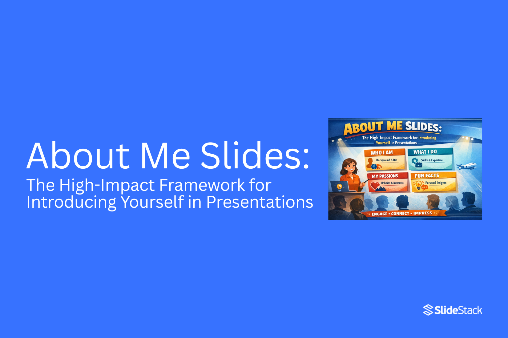
About Me Slides: The High-Impact Framework for Introducing Yourself in Presentations
Many presentations start with an About Me slide. Yet most of these slides feel weak or unclear. They list facts but fail to connect. The audience sees the slide but does not remember the speaker. This makes the opening feel flat and easy to ignore.
That weak start creates a bigger problem. Attention drops early. People lose interest before the main message begins. The speaker misses a key chance to build trust and show value. A simple intro turns into a lost moment.
This is where a clear framework helps. This article shows a high-impact way to introduce yourself. It breaks down proven structures and real examples. You will see how to turn a basic slide into a strong and clear opening.
What is an ‘About Me’ slide in a presentation?
An “About Me” slide is a short introduction at the start of a presentation. It tells the audience who you are and why they should listen. That sounds simple. Most people stop there. That is the problem. A strong “About Me” slide does more than share your name or job title. It gives the audience a clear reason to trust you. It shows what you know and how you connect to the topic.
Think about the moment before you speak. The audience has one question in mind:
Why should I care about this person?
Your slide answers that question right away.
A weak version lists facts. For example:
• Name
• Job title
• Company
This feels flat. It gives information but no meaning.
A stronger version adds context:
• What you do
• Who do you help
• What results you create
Now the audience can place you. They understand your role and your value.
For example, compare these two lines:
“I am a marketing manager.” “I help small brands grow sales through simple ad campaigns.”
The second line is clearer. It shows impact. It gives a reason to listen. That is the real purpose of an “About Me” slide. It builds trust fast and sets the tone for everything that follows.
Why Your About Me Slides Matter for Professional Success
Most people treat this slide as a quick intro. That is a mistake. This slide shapes how people see you. It sets the tone for everything that follows. A weak slide creates doubt. A strong slide builds trust right away.
Your audience makes a decision fast. They ask simple questions in their mind. Who is this person? Can I trust them? Is this worth my time? Your slide answers all of that in seconds. A name and a job title are not enough. That only tells people who you are. It does not show why you matter. It does not show what you bring.
So the real goal is not to introduce yourself. The real goal is to position yourself. Positioning means you guide how people see you. You give them a clear reason to listen. You make your role and value easy to understand. Without that, your message struggles to land. People stay unsure. They may listen, but they do not fully believe.
Now look at the other side. A clear and focused slide removes doubt. It shows your role, your experience, and your value in a simple way. It gives people a reason to trust you early. That trust carries through the whole presentation. There is also a hidden effect. Your confidence grows when your slide is clear. You know what you stand for. You know what you want people to see.
That changes how you speak. Your tone feels steady. Your message feels direct. This is where most slides fall short. They list too many details. They try to say everything at once. Or they stay too basic and say almost nothing. Both paths lead to the same problem. The audience feels no clear signal. So keep this in mind. Your About Me slide is not a formality. It is a strategic tool. It shapes trust, clarity, and attention from the start. Build it with intent. Make every line count.
How to Introduce Yourself in a Presentation: 4 Approaches
Introducing yourself in a presentation sets the first signal for the audience. It shows who is speaking and why they should listen. This part often shapes how people respond to the rest of the talk.
Most introductions sit at the start of a presentation. They come right after a short opening or right after the title slide. This position helps the audience settle into the topic before deeper points begin.
Some audiences already know the speaker. Others are meeting them for the first time. Known audiences focus more on role and purpose. New audiences pay closer attention to background and clarity of identity. Both situations need a clear and simple approach.
A strong introduction does more than share a name. It builds direction for what follows. It also creates a natural entry point into the main message.
Four approaches help shape this part of a presentation. Each one gives a different way to present identity, role, and purpose. The next section breaks these approaches down in a clear and practical way.
1. Mention Your Name and Affiliations
Start the presentation with the basic introduction. Say your name, company, title, or position. Add a few quick facts about what you do. Even in a familiar room, a short recap helps people reset and follow along.
Keep it simple and clear. Long introductions slow things down. Short lines work better.
To make it more interesting, you can add a few small personal details. These should support your message, not distract from it.
You can include:
• Your interests
• Recent work wins
• Hobby or side projects
• A short quote or feedback from a teammate
• A nickname people use for you
These small details can help break the ice. They work well in team updates, project reviews, or client check-ins. They also help if you are early in your career and want to share more about your work outside formal experience.
Simple structure you can use
• Name, role, and company in one line
• One or two extra facts for context
• One light personal detail if it fits
Keep the order clean. Start with identity, then role, then small extras.
Examples
For a client case study presentation:
“Hi, I’m Lynda, Chief Customer Success Specialist at Acme Corp.
(Also known for replying faster than most support tools in the company)
47 NPS score | 15% churn rate | 40% repeat purchase rate.”
For a team project review:
“Mike, Project Manager at Cool Project
(Also called Maximizer by the team)
Project stats:
387 Slack messages answered
56 cups of coffee
$1.2M project profit margin.”
Work On Your Elevator Pitch
People decide quickly how they see you. A short message shapes that first view.
An elevator pitch is a short way to explain who you are and what you do. It takes about 20 to 30 seconds to say. The goal is simple. Make others understand you without confusion.
Many pitches fail because they try to say too much. Others stay too vague. Both make people forget the message fast.
A strong pitch follows a clear structure. Start with your role. Add what you help with. Then state the result you create.
Here is a simple breakdown:
• Who you are
• What you do
• Who do you help
• What outcome do you deliver
Clarity matters more than style. Long words and extra details slow the message. People lose focus and move on.
Here is a basic example:
“I help small business owners improve their online sales with simple marketing systems.”
Now break it down:
• Role: I help
• Audience: small business owners
• Action: improve online sales
• Method: simple marketing systems
Short. Clear. Direct.
Many people add filler lines or try to sound impressive. That weakens the message. Strong communication does not need decoration. It needs focus and structure. A sharp elevator pitch stays the same across meetings, emails, and networking. It becomes your default way of introducing yourself without effort.
3. Answer Popular Questions or Assumptions
People often want quick clarity about you. A slide can handle that well. Start by listing real questions people ask. These are not random. They come from your audience. Think about confusion, doubt, or repeated curiosity around your work.
Keep the questions short. One idea per line works best.
A simple structure can help:
• Question
• Short answer
• One supporting detail
Example:
• What do you do?
• I help teams design clear presentations. I focus on structure and message.
• Why does your work matter?
• It helps people explain ideas in a simple way.
• What problems do you solve?
• I fix unclear slides and weak messaging.
Avoid adding too many questions. Five is often enough. More can feel crowded and hard to read. Each answer should stay short. One or two lines are enough. The goal is clarity, not detail overload.
4. Focus on Telling a Story
A short story helps people remember you. Facts alone can feel flat. Start with a simple moment from your work or experience. Keep it real and direct. No need for dramatic detail.
A clear flow works well:
• What was happening
• What challenge came up
• What changed after
Each part should stay brief. One idea per sentence keeps it easy to follow.
Example structure:
You worked on a project with unclear slides. The message was getting lost. You simplified the layout and focused the content. The final result became easier to understand. Avoid adding extra examples that do not connect to your main point. One story is enough for a slide. The goal is not to impress with volume. The goal is to show how you think and solve problems in a simple way.
How to Give a Presentation About Yourself: 4 Fool-Proof Tips
On some occasions, you may need to give a full-length presentation about me. This can happen during a job interview, onboarding, or a training session. In these moments, people want to know who you are and what you do in a clear way. A simple structure helps you stay focused and makes it easy to follow.
What to Put in a Presentation About Yourself?
The audience expects a mix of personal and professional details. The content should stay clear and easy to understand. Each point should give useful information about you.
Include these items:
• Your name
• Contact details
• Website or online portfolio
• Social media links
• Short bio with key details about you
• Career path or timeline
• Main achievements with clear results
• Education background
• Training or special courses
• Awards or recognition
• A personal detail, such as a hobby or interest
• A goal or future focus
Each item adds a small part of your story. Together, they build a full picture of who you are. The order of information can change based on the setting. A job interview may focus more on skills and results. A training session may include more background and interests. A clear flow keeps the presentation easy to follow. A short structure also helps you stay confident. Each slide should carry one idea. This keeps attention on your message without confusion.
1. Create a List of Facts About Me
People often get stuck when asked to talk about themselves. The words feel simple, but the answer does not come out clearly. A strong start begins with a list. Write down basic facts about yourself. Do not filter at this stage. Keep it simple and honest.
Break your facts into small groups:
• Your job or current role
• Skills you use often
• Things you have achieved
• Interests outside work
• Personal traits that describe you
• Future goals or direction
Each group helps you see a full picture. Nothing needs to be perfect here. The goal is to collect raw points. Once the list is ready, patterns start to show. Some parts feel more important than others. Some points connect naturally. Now the list turns into a structure. Each group can become one slide. One slide can focus on your role. Another can show skills. Another can share achievements. This keeps your presentation clear and easy to follow. A simple list becomes the base of your full story.
2. Think Like Your Audience
A presentation is not only about you. It is also about the people in the room. Each person is there for a reason. Many want clear answers. Some want proof of skill. Others want to see fit for a role or idea. Their attention is limited. They scan for signals. They notice clarity. They notice confidence. They also notice confusion quickly.
A strong approach starts with simple questions:
• Who is in the room
• What do they need to decide
• What problems matter to them
• What would build trust in you
These questions shape your message. They guide what you include and what you leave out. Some presenters talk only about their own story. That often misses the mark. The better path links your story to their goals. Your experience becomes useful only if it answers their needs. Keep your focus on what helps them move forward. Share facts that support that. Keep examples short and clear. Remove details that do not help their decision. Clear alignment builds trust. Confusing details slow it down. Every part of your message should have a reason tied to the listener’s needs.
3. Include Testimonials and Recommendations
Trust grows faster when other people speak about your work. A single voice feels limited. Real feedback from others shows real experience. It helps readers feel safer about a choice.
Different types of proof can be used. Each one adds a layer of trust.
• Customer testimonials that share personal results
• Short quotes from clients about their experience
• Written reviews from past users
• Ratings from review sites
• Short case notes showing outcomes
• Feedback from partners or collaborators
Public review sites also help. Platforms like TrustPilot show open feedback from users. These reviews are visible to anyone. Reading more than one review gives a clearer picture of service quality and consistency. Strong feedback does more than describe a service. It shows how real people felt after using it. It reduces
Case Study Use in a Presentation
A case study shows real results from real work. It gives proof instead of claims. It helps the audience see how an idea works in practice. A strong case study builds trust. It shows the steps taken, the problem faced, and the outcome achieved. It also helps explain value in a clear way without extra explanation.
A case study can take different forms. Each form depends on the goal and the message.
• Short story format that explains the situation, action, and result
• Before and after comparison that shows change over time
• Simple data snapshot that highlights key numbers
• Client result summary that focuses on measurable impact
Each format should stay simple. The goal is clarity, not decoration. A clear structure keeps the message strong. Start with the situation. Move into the action taken. End with the result. Keep each part short and direct. Strong case studies leave a clear impression. They show proof in a way that is easy to follow and hard to ignore.
Real-Life Examples of How Professionals Introduce Themselves in Presentations
Real-life examples show how professionals introduce themselves in presentations. They turn ideas into clear actions. Advice alone often stays general. Examples show what actually gets said in real situations.
Many people know what they should include in an introduction. Name, role, and purpose are common parts. Still, the way these parts are shared can change a lot. Some speakers keep it very direct. Others add a short story or a key achievement.
Real examples help you see those differences. You notice how the tone changes based on the audience. A corporate meeting sounds different from a workshop. A sales pitch sounds different from a training session. The structure may look similar, but the delivery shifts.
Two examples help show this clearly. One comes from a formal business setting. The other comes from a more relaxed professional space. Both share the same goal. They introduce the speaker in a clear and confident way. The wording and flow are not the same.
Looking at real introductions also shows timing. Some speakers introduce themselves in one short section. Others spread it across a few early moments in the talk. These choices shape how the audience responds in the first minutes.
Examples like these make patterns easier to notice. They show what works in real rooms with real people listening.
Hans Rosling at TED 2006: Using Context as the Introduction
Hans Rosling stands on the TED stage in 2006 with a clear goal. He wants the audience to rethink what they believe about the world. He does not start with charts or numbers. He starts with a gap between perception and reality. He asks simple questions. He asks about child health, income, and global progress. The audience gives answers quickly. Many answers are wrong. Not slightly wrong, but far from reality. That gap becomes the starting point of his talk. The room feels like a quiz, but it is not about winning. It is about revealing assumptions. Rosling lets those assumptions sit in the open. He does not correct them right away. He lets them stay visible for a moment.
He shows how different groups of countries are often grouped in the mind. Rich and poor. Developed and developing. These labels feel clear, but they hide real movement over time. Countries shift. Health improves. Income changes. The world does not stay in fixed boxes. Rosling uses this moment to reset how the audience sees the topic.
He builds a frame before showing any deep data. That frame becomes the reference point for everything that follows. Only after that does he move into his data tools. Animated graphs appear. Countries move across the screen over time. Health and income shift together. The story becomes visible, not just spoken.
The data feels easier to follow because the mind has already been prepared. Without that setup, the charts could feel confusing. With it, each movement has meaning. Rosling’s choice is not random. It reflects a clear communication strategy. He places context first so the audience does not misread what comes next. The introduction does not describe the data. It shapes how the data will be understood.
Many presentations start with information. Charts come early. Numbers come first. The audience then tries to build meaning while still adjusting to the topic. Rosling reverses that order. He builds understanding before detail. This approach changes attention. The audience is not trying to decode meaning while watching data. The audience already knows what to look for. There is another effect. It reduces confidence in assumptions.
When people see that their answers are wrong, they become more open. That openness matters for learning. It creates space for correction without resistance. Rosling also avoids abstract explanation. He does not describe global change in general terms. He shows it. He places real movement on the screen. Countries are not static points. They are moving objects with direction over time. The context he builds is not background noise. It is structured. It holds the entire talk together.
This design choice changes how the message lands. The audience does not just hear facts. The audience sees why those facts matter. A key part of his method is timing. He delays information until the mind is ready. That delay is not empty space. It is preparation. It builds curiosity and reduces confusion later.
The result is a cleaner path through complex material. Each chart connects back to the setup at the beginning. Nothing feels isolated. There is also restraint in his delivery. He does not overload the introduction. He keeps it simple. Short questions. Clear contrasts. Direct feedback from the audience. That simplicity helps the context stay sharp. Once the foundation is set, the data can carry more weight. The audience does not need constant explanation.
The earlier framing already does part of that work. This approach changes how presentations can be built. Many speakers treat context as something minor. A short opening before the main content. Rosling treats it as the core structure. The lesson is not about adding more explanation. It is about placing the explanation at the right point in the flow. When context comes first, the rest of the message becomes easier to follow. Misunderstanding drops. Attention increases. The story becomes clearer without extra effort from the speaker.
Rosling’s TED 2006 talk shows that structure can matter more than volume. The order of ideas shapes how those ideas are received. Context is not decoration at the start. It is the base that supports everything after it.
Will Larson and Dan Fike at QCon SF 2024: The Logo-Only About Me Slide
At QCon San Francisco 2024, Will Larson and Dan Fike gave a talk called “Ambiguous Roles and Ambiguous Problems: Navigating Life as a Principal Engineer.” They are both from Carta.
Their intro slide had a simple layout. It was split into two columns. One column was for Will. One column was for Dan.
Each column showed only a name at the top. Under each name was a vertical list of company logos. There was no job title. There was no extra text.
Will’s side showed Carta, Calm, Stripe, and Uber. Dan’s side showed Carta, Google, Yahoo!, and Volition Inc. That was the full slide.
The slide design puts focus on the companies instead of written details. Each logo carries meaning on its own. People in the room can often recognize these companies right away. That recognition replaces long explanations.
A Stripe or Google logo can suggest large systems and complex engineering work. Uber can point to fast growth and scale problems. Carta appears on both sides and sets a shared base for both speakers. The audience can connect each name to past work without reading anything else.
The two-column layout also sets a balance between the speakers. Neither side looks more important. The equal spacing keeps both presenters on the same level. The simple first-name labels support that same idea. It feels like a peer exchange instead of a formal hierarchy.
This style works best in rooms where people already know the companies. In that setting, the logos carry enough meaning on their own. The slide supports quick understanding and keeps attention on the talk itself.
Outside that type of audience, the meaning can become unclear. Some viewers may not know the companies or why they matter. In those cases, the slide does not give enough detail about each person’s work history or impact.
Final Notes
An “About Me” slide is not a filler at the start of a presentation. It is the first signal your audience receives about you. That moment sets the direction for everything that follows. If the message is unclear, attention drops early. If the message is sharp, people stay with you longer.
Many introductions fail for a simple reason. They list facts without meaning. Name. Job title. Company. That structure gives information but no context. The audience cannot see value in it. They remember very little.
A stronger approach focuses on clarity. It connects identity with purpose. It shows what you do and why it matters. It also removes confusion about your role. This makes your presence easier to understand in seconds.
Different formats help shape this section. A simple personal intro works in formal settings. A short pitch works when attention is limited. A question-based format helps clear doubts fast. A short story helps people remember you through real moments. Each approach serves a different situation, but the goal stays the same. Make your role easy to understand.
Full presentations about yourself follow the same idea on a larger scale. They are not a list of details. They are a structured view of who you are. Each slide should carry one clear idea. Too much information in one place weakens focus. A clean structure keeps attention stable.
Preparation also matters. A simple list of facts helps shape direction. It shows what is important and what can be removed. Audience focus then becomes the filter. People care less about everything you know and more about what helps them understand your value.
Trust plays a central role. Real feedback, reviews, and case studies add proof. They show results instead of claims. That makes your message stronger without extra explanation.
Strong examples from real speakers show the same pattern. Some use context to frame understanding before data. Others use simple visuals to represent experience. The format changes, but the purpose stays consistent. Make the introduction clear enough so the rest of the presentation becomes easier to follow.
An effective “About Me” slide is not about showing everything. It is about showing the right things in a simple way. Every line should guide understanding. Every detail should support clarity.
FAQs:
1. What is an About Me slide?
It is a short introduction at the start of a presentation. It shares who you are and what you do.
2. Why do About Me slides matter in presentations?
They set the first view of the speaker. They help the audience understand your role early.
3. What should I include in an About Me slide?
Name, job role, and main work area. Add a short line about what you do for others. Keep details simple.
4. How long should my introduction be?
It should stay short. A few lines work best. Long text reduces attention.
5. What makes a weak About Me slide?
A weak slide lists only basic facts. It does not show value or purpose.
6. Can I use stories in my introduction?
Yes. A short story can show your work in action. Keep it brief and focused.
7. How can I make my introduction clear?
Use simple words. Focus on one main idea. Remove extra details that do not support your message.
8. Should I add personal details?
Only a few. Add details that support your role or help explain your work style.


You may also be interested in ...

How To Create An Eye-Catching Portfolio
If you’re looking to create an eye-catching portfolio, this post will come in handy. In this article, you can find the easies...
23 Jun, 2024

How To Easily Create An Infographic
Infographics are the perfect way to make a presentation that will impact an audience, but their design and composition might...
08 Jun, 2024

PowerPoint Template Tips & Tricks You Ne...
PowerPoint seems to be an unknown world for many people, especially those who have been assigned to create a presentation out...
08 Jun, 2024