Comparison Charts Infographics Presentation Premium
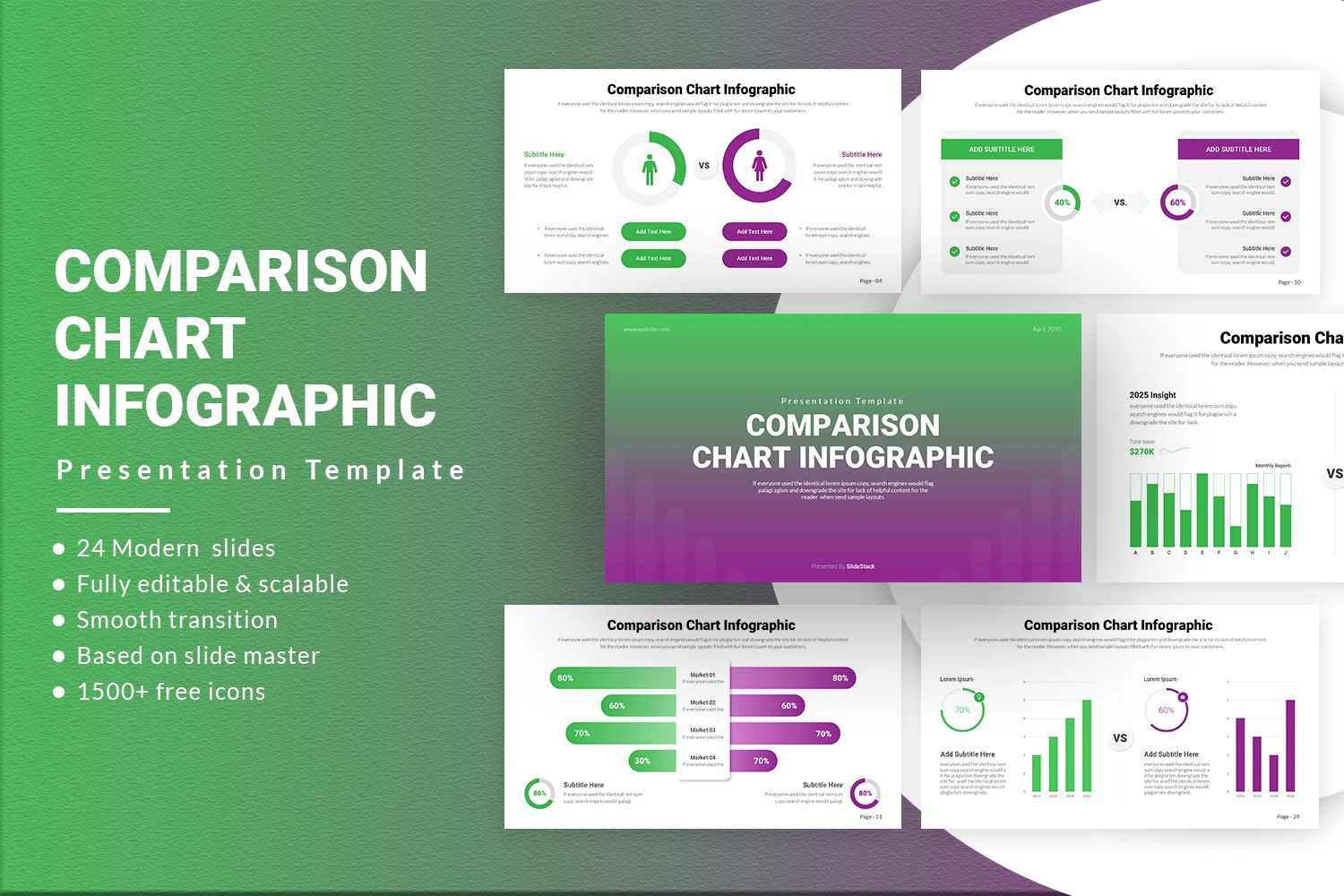
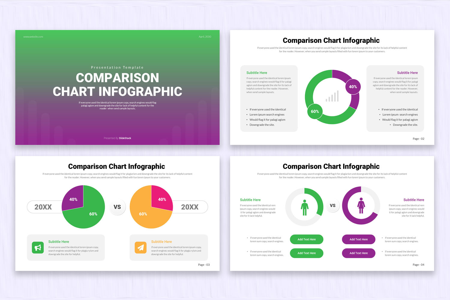
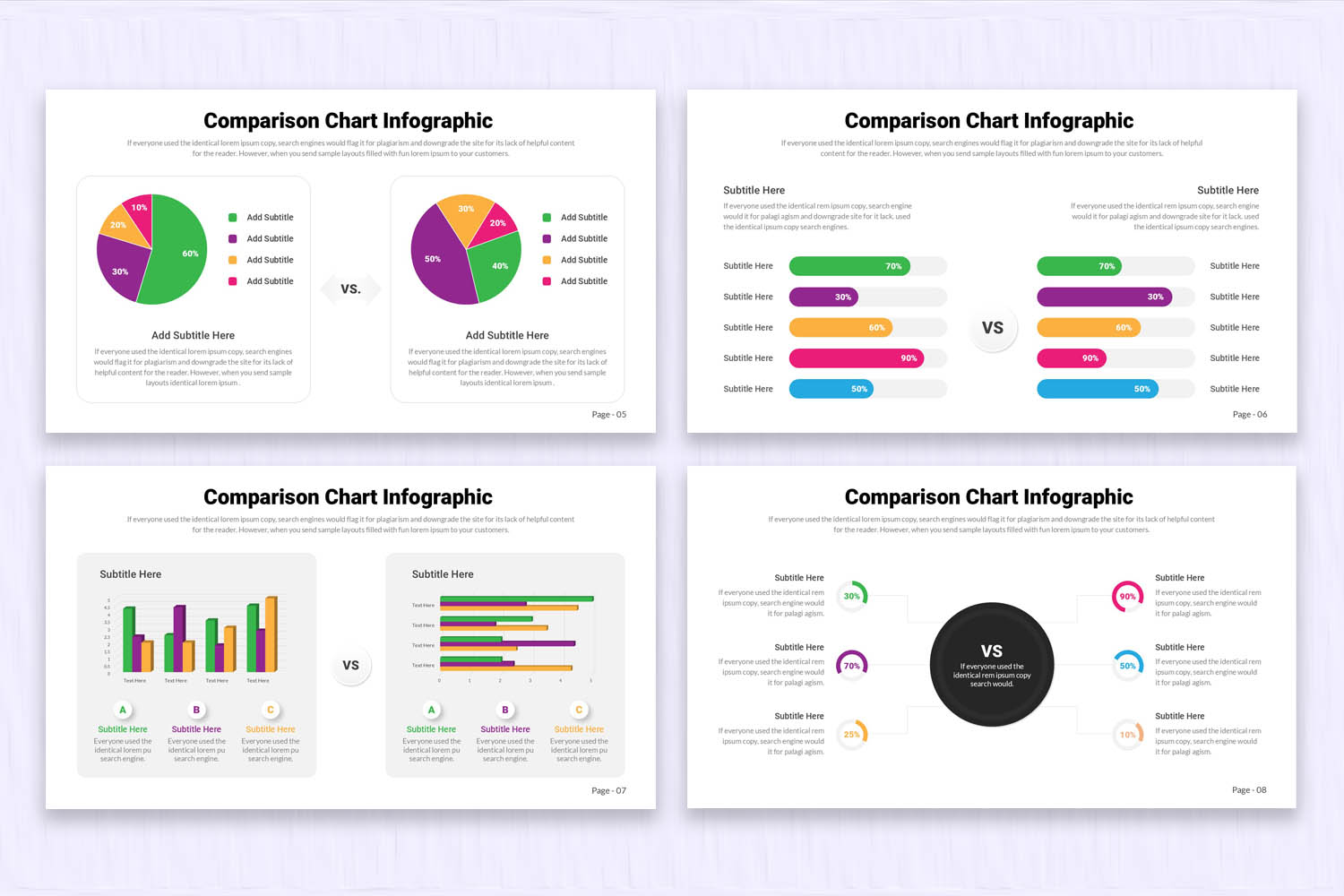
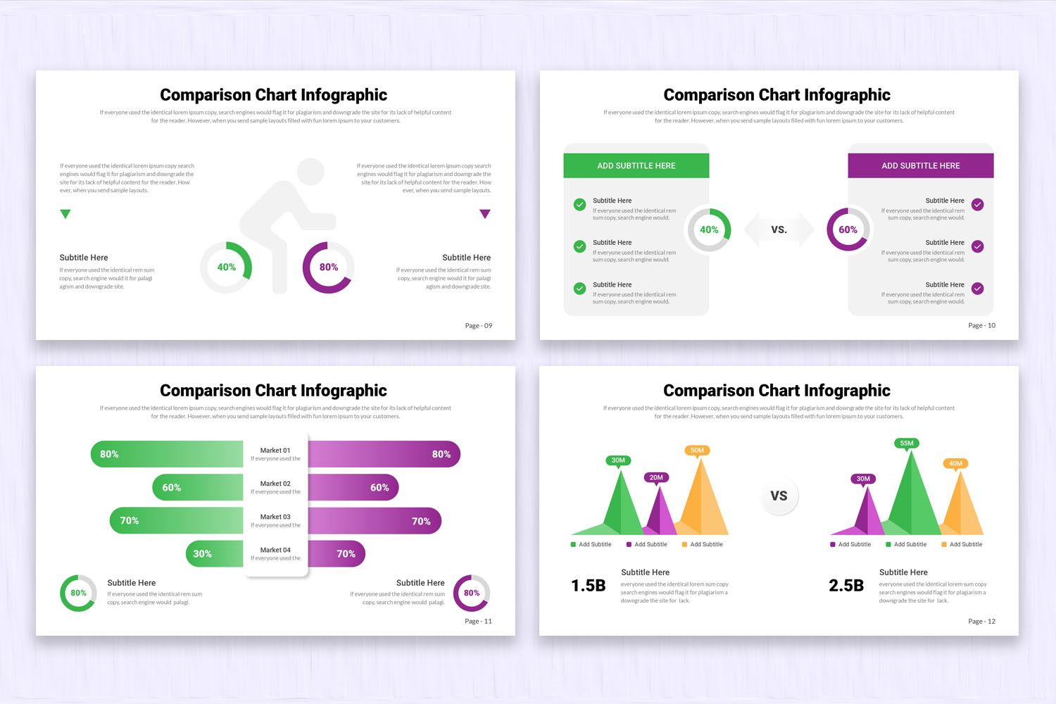
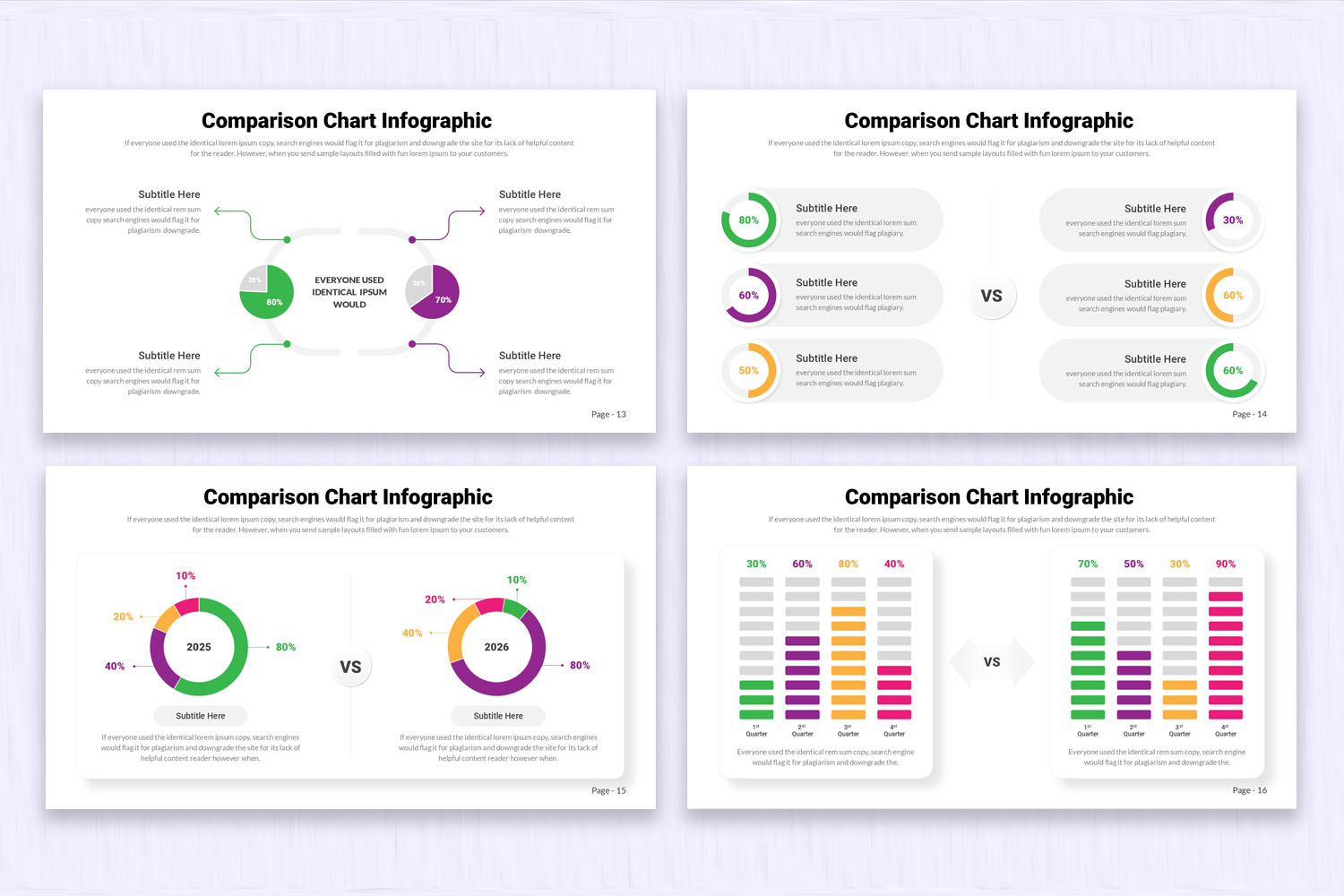
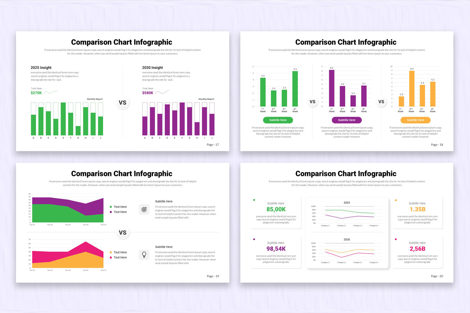
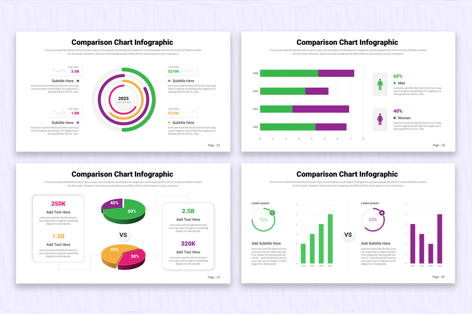
Sometimes, you need to compare between two to six different groups of characteristics, products, or services. That is why we have created these PowerPoint presentation comparison slides. All slides include different types of comparison layouts; some focus on health, while others are designed for business and marketing use. There is a wide variety of infographics created to make comparisons clear, structured, and visually easy to understand.
Product Features:
- 24 clean, creative, & modern slides.
- 16 x 9 Widescreen (No more broken slides)
- 1920 x 1080 px (Full HD & retina-ready)
- Based on Master Slides
- PPTX and PPT Files (For both the latest and old versions of PowerPoint)
- Editable Google Slides Theme
- 1500+ Icons (750+ vector icons & 750+ font icons)
- Image Placeholders (Drag-and-drop your photo)
- Elements are fully editable in PowerPoint and Google Slides
- Device mockups included
- Data Charts Editable via Excel
- Interactive and Easily Editable Maps
- Easy Editable Colors
- Fast & Friendly Support
If you have any questions or need support about this product, please contact us. We'll help you!
Check out more Related Presentation Templates here.
FAQs:
1. What are comparison charts and infographic presentations used for?
They are used to visually compare two or more items, such as products, services, or data sets, making differences and similarities easier to understand.
2. How many items can be compared in these presentation slides?
These templates typically support comparisons between two and six different groups, depending on the layout design.
Product Specs
- Release: Apr 22, 2026
- Last Update: Apr 22, 2026
- Aspect Ratio: Widescreen (16:9)
- Compatibility: Google Slides, PPT, PPTX